This page describes how to customize your optimization visualizations. The
OptimizationResults data object that is outputted by the optimizer also
contains plotting methods to visualize them.
Change in optimized spend
You can view an optimized spend change per channel visualization to compare your current budget to the optimized spend. This gives you more granular insights per channel.
Run the following command to plot the optimized change in spend per channel:
optimization_results.plot_spend_delta()
Example output:

Optimized incremental revenue or KPI
You can view the change in incremental revenue or KPI from the historical data to the optimized data. The visualization starts out with the current incremental revenue or KPI and shows the differences per channel to reach the optimized incremental revenue or KPI.
Run the following command to plot the optimized incremental revenue or KPI:
optimization_results.plot_incremental_outcome_delta()
Example output:

Optimized budget allocation
You can visualize the budget allocation optimization by channel for an overall recommendation of how to allocate your budget.
Run the following command to view the optimized budget allocation for each channel:
optimization_results.plot_budget_allocation()
Example output:

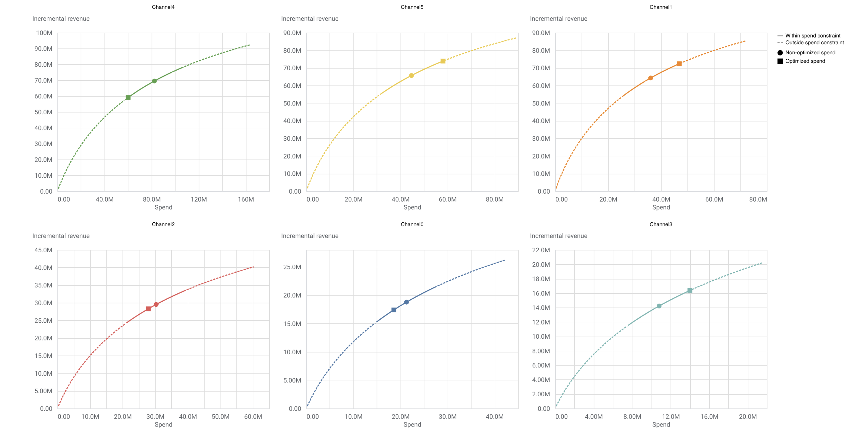
Optimized budget on response curves
Response curves show how much revenue might be made as you increase your budget. The solid line represents the spend constraint bounds that were set for the optimization and the plot indicates two points: the current spend level and the new optimized spend level.
Run the following command to plot optimized budget on response curves:
optimization_results.plot_response_curves()
Example output: (Click the image to enlarge.)