You can view the visualizations for the media effects through the MediaSummary
and MediaEffects classes. Each has different plots to show the media metrics
per channel. These let you create customized plots that are not available in the
standard HTML output. For example, you can plot specific channels, change or
delete the credible interval, add Adstock decay, and add Hill saturation curves.
Under the MediaSummary class, you can plot the following charts:
- Contribution area chart
- Contribution bump chart
- Contribution waterfall chart
- Contribution pie chart
- Spend versus contribution
- ROI by channel
- ROI versus effectiveness
- ROI versus marginal ROI
Under the MediaEffects class, you can plot the following curves:
Contribution area chart
The Contribution Area Chart shows the contribution of each marketing channel to the total outcome (revenue or KPI) over time as a stacked area. The height of each colored band at a specific time point represents that channel's contribution. The total height of all bands at a time point represents the total outcome. Changes in band thickness over time indicate shifts in a channel's contribution.
Run the following command to plot the channel contribution area chart:
media_summary.plot_channel_contribution_area_chart()
Example output:

Contribution bump chart
The Contribution Bump Chart illustrates the relative rank of each channel's contribution, including the baseline, based on incremental outcome over time. Each line represents a channel, and its vertical position at a given time point indicates its rank. Rank 1 signifies the highest contribution. Lines moving up show an improving rank, while lines moving down indicate a declining rank. Crossing lines highlight changes in relative performance between channels. Ranks can be displayed weekly or at the end of each quarter.
Run the following command to plot the channel contribution bump chart:
media_summary.plot_channel_contribution_bump_chart()
Example output:

Contribution waterfall chart
The Contribution waterfall chart shows users how much each channel contributed to the total amount of incremental revenue or KPI. The baseline displays the amount of revenue or KPI without any media effects.
Run the following command to plot the contribution waterfall chart:
media_summary.plot_contribution_waterfall_chart()
Example output:

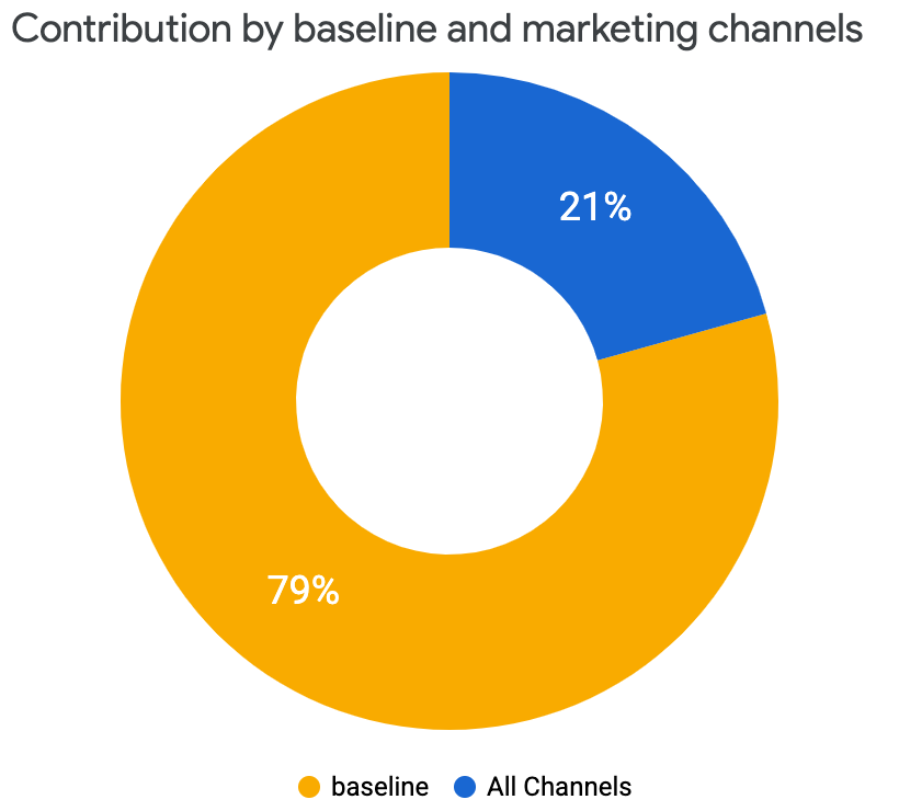
Contribution pie chart
You can view a pie chart representation of the incremental revenue or KPI contribution coming from all of the channels, which is compared to the baseline without any media effects.
Run the following command to plot the contribution pie chart:
media_summary.plot_contribution_pie_chart()
Example output:
Spend versus contribution
The spend versus contribution chart compares the spend and incremental revenue or KPI split between channels. This visualization shows the percentage of media spend used by each channel and the percent each channel contributed to the total incremental revenue or KPI. 100% of revenue (or KPI) is the total incremental revenue (or KPI) from media, not including the baseline. Lastly, the green bar highlights the return on investment (ROI) for each channel.
Run the following command to plot the spend versus contribution:
media_summary.plot_spend_vs_contribution()
Example output:

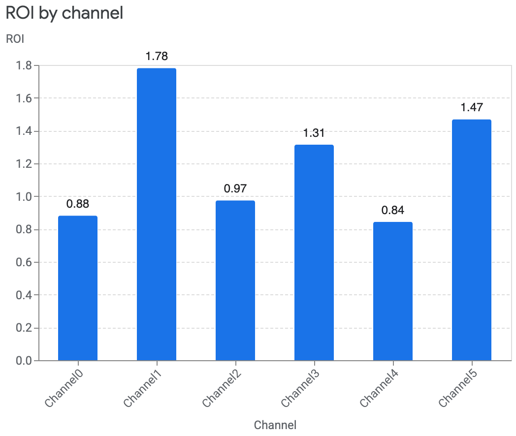
ROI by channel
Comparing the return on investment (ROI) between channels helps you understand how spending on each channel has impacted revenue. ROI is calculated by revenue per dollar spent. This is plotted showing the credible interval.
Run the following command to plot ROI by channel:
media_summary.plot_roi_bar_chart()Example output:

You can also remove the credible interval (
ci) or update it to a different credible interval.The following example shows how to remove the credible interval:
media_summary.plot_roi_bar_chart(include_ci=False)Example output:
For the case where your data contains a non-revenue KPI type with an unknown monetary unit value, you can compare the cost per incremental KPI (CPIK) instead.
Run the following command to plot CPIK by channel:
media_summary.plot_cpik()
ROI versus effectiveness
You can compare how each channel's return on investment (ROI) is against the channel's effectiveness by plotting ROI versus effectiveness. Effectiveness is measured by how much incremental revenue is gained per media unit. For this plot, the size of each channel maps to the level of spend. The larger the circle, the more that was spent on the channel.
Run the following command to plot the ROI versus effectiveness:
media_summary.plot_roi_vs_effectiveness()Example output:

You can also customize the channels they want to compare and also choose to plot without the size differences.
Run the following command to disable the size differences:
media_summary.plot_roi_vs_effectiveness(disable_size=True)Example output:

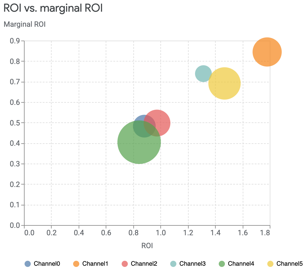
ROI versus marginal ROI
You can compare the return on investment (ROI) to marginal return on investment (mROI), where mROI is the return on investment from an additional unit spent. The size of the circle maps to the amount spent on the channel. The larger the spend, the larger the circle.
Run the following command to plot ROI versus mROI:
media_summary.plot_roi_vs_mroi()Example output:
You can select the specific channels to view and opt to display equally sized ROI and mROI axes. You can also disable the size differences.
The following command example selects specific channels and sets the axes as equal:
media_summary.plot_roi_vs_mroi(
    selected_channels=["Channel1", "Channel4"],
    equal_axes=True
)
Example output:

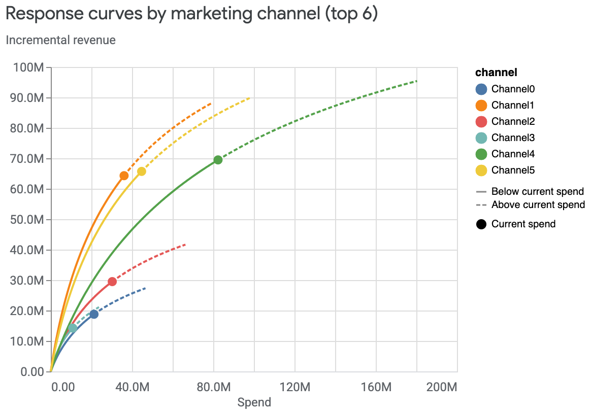
Response curves
Response curves show your current spend level and where you start to see diminishing returns on the spending per channel.
You can view each channels' response curves shown together in one plot or plotted independently. The shaded area of the plot shows the credible intervals while the point indicates the current spend.
To view response curves in independent plots:
media_effects = visualizer.MediaEffects(meridian)
media_effects.plot_response_curves()
Example output: (Click the image to enlarge.)

To view the curves together in one plot and hide the credible intervals:
media_effects = visualizer.MediaEffects(meridian)
media_effects.plot_response_curves(
    plot_separately=False,
    include_ci=False
)
Example output:
To view response curves only for the top channels based on spend:
media_effects = visualizer.MediaEffects(meridian)
media_effects.plot_response_curves(
    plot_separately=False,
    num_channels_displayed=1
)
Example output:

Adstock decay
The Adstock decay visualization shows the decay rate of the media effects, with the geometric Adstock decay that Meridian uses having the peak effect on the first day. This method accounts for the impact an advertisement has on a consumer even after the ad was shown.
If the posterior is higher than the prior, then the effects of running an ad on that media channel last longer than was assumed.
The time units displayed are limited to the max_lag value, which is set to 8
time units in the following example output. Typically this is set to weeks, but
you can use days instead.
Run the following command to plot Adstock decay:
media_effects.plot_adstock_decay()
Example output: (Click the image to enlarge.)

Hill saturation curves
The Hill saturation curves show the diminishing returns of ad impressions on a consumer. The model uses a C shape curve to show the reduced effectiveness, or saturation. In the following example, the Y-axis shows the relative effectiveness of showing infinite ads. The X-axis shows the impressions per capita, where an impression is any time a customer sees the ad. This combination shows how saturated each media channel is.
This graph also displays the histogram of the data, with how many ads per capita were shown over all of the available time periods and geos of data.
Run the following command to plot Hill saturation curves:
media_effects.plot_hill_curves()
Example output: (Click the image to enlarge.)
